The link in bio ideas that work give the page one job: the first button is the single thing you most want a visitor to do, the block under it proves you are worth the tap, and an email sign-up catches everyone who is not ready yet. Below are 21 ideas sorted by that job (sell, grow a list, get booked, serve local customers, run a launch), with button labels to copy and a way to check which ones earn their place.
What should you put in your link in bio?
Put one offer first, one piece of proof second and one way to stay in touch third. Everything else goes below those three or into a row of icons. A visitor arrives from a specific post with a specific question, and the first screen of the page either answers it or loses them.
- The offer. Whatever your recent posts point at: the product, the booking, the free guide. One button, with a label that names it.
- The proof. Your latest reels, a testimonial or a price list. It answers "is this the right person?" without a tap.
- The safety net. An email sign-up, for the visitor who is interested and busy.
- The rest. Other channels as icons, the FAQ, contact details.
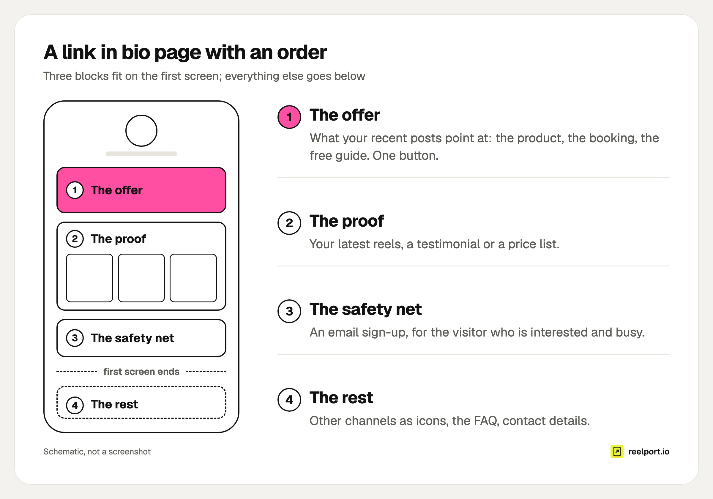
The first screen holds the offer, the proof and the sign-up; everything else sits below.
The 21 ideas below are candidates for those slots. Pick the group that matches your goal this month and ignore the others.
Which link in bio ideas help you sell?
Selling ideas shorten the distance between the post and the checkout. The best ones remove a step: the product is bought on the page itself, or the post the visitor just saw is the thing they tap. Start with one product, then add the rest when the first one sells.
- One product, sold on the page. A product card with a price and a checkout, so the visitor never leaves for a shop homepage.
- A tappable post grid. Your Instagram posts as a grid, each tile opening the product it shows. It answers the comment "where can I get this?" for good.
- A discount code to copy. A code block the visitor copies with one tap, with a link to the shop next to it. Name the code after the channel so you can see it in your shop's reports.
- A tip jar. For creators whose audience asks how to support them. The fan picks the amount.
- A membership. A monthly payment that opens members-only blocks on the same page: the full recipe, the stems, the group link.
Which link in bio ideas grow an email list?
List ideas trade something specific for an address. A bare "subscribe to my newsletter" asks for trust up front. A named file, a waitlist with a date or one useful question gives the visitor a reason today, and you a list you own when a platform changes its rules.
- A lead magnet. A checklist, a template or a sample chapter, delivered once the email address is confirmed. One file that solves one problem beats a bundle.
- A sign-up with one question. Ask what they want to hear about (wholesale or retail, beginner or advanced). The answer tells you what to send.
- A waitlist. Before a launch, the offer slot holds a sign-up with the date in the label. On launch day you swap it for the product.
- The link by DM. Viewers comment a keyword under the reel and get the link as a direct message, so they do not have to visit the bio at all. Our guide to Instagram comment to DM automation covers the rules.
Which ideas get you booked or hired?
Booking ideas answer the two questions a client has before writing to you: what does it cost, and when are you free. If the page answers both, the first message you receive is a booking and not a question.
- A bookable call. A paid call, or a free calendar link for discovery calls. Put the length and the price in the label.
- An event with a calendar button. Date, time, place and a tickets link, with "Add to calendar". Use one that removes itself when the event is over, so the page never advertises last month.
- A contact card. Visitors save your details to their phone as a contact. Useful at trade fairs and markets, where the page is opened from a QR code.
- A media kit. For creators who work with brands: audience numbers and past work on the page, so a brand manager does not need to ask for a PDF.
What should a local business put in its link in bio?
A local business page answers practical questions fast: where are you, when are you open, can I book. Those visitors are often already on their way, so directions and opening hours beat any campaign link.
- A map with directions. One tap opens the route.
- An FAQ. Opening hours, parking, returns, allergens. Every answer on the page is a DM you do not have to type.
- A QR code offline. Print the page's QR code on the menu, the packaging or the shop window. Scans should show up as their own source in your stats, so you can see whether the print run paid off.
- Blocks by country or language. A shop that ships to Germany, Austria and Switzerland shows the shipping note only there, and the English menu only to English browsers.
Which link in bio ideas work for a launch or a sale?
Timed ideas change the page for a few days and then undo themselves. They are the ones people forget to remove, which is why a page should be able to do it alone: a block that appears on Friday at 00:00 and hides on Monday needs no reminder.
- Send everyone to one link. On launch day, every visitor goes straight to the launch page, until a date and time you set. Then the normal page returns.
- A scheduled block. The sale button shows from the first hour of the sale to the last, in the top slot.
- A countdown. For a drop, a ticket release or a live stream.
- A link behind a code. Early access for subscribers: the link's address stays hidden until the visitor enters the code from your email.
Which ideas fit which goal?
Use the table to pick a top block and the number to watch. One goal per month is enough; a page that sells, books and recruits at once does none of them well.
| Goal | Put first | Back it with | Watch |
|---|---|---|---|
| Sell a product | Product card with checkout (1) | Post grid (2), discount code (3) | Sales per block |
| Grow a list | Lead magnet (6) | Latest reels, one-question sign-up (7) | Sign-ups divided by views |
| Get booked | Bookable call (10) | Testimonial, price list, media kit (13) | Clicks on the booking button |
| Local visits | Map with directions (14) | FAQ (15), event (11) | Clicks on directions, QR scans |
| Launch | One link for everyone (18) | Countdown (20), waitlist (8) | Clicks on launch day |
What should link in bio buttons say?
A button label names the thing and removes one doubt: verb, object, detail. "Get the free glaze guide (PDF)" tells the visitor what happens after the tap and what it costs. "Click here" and "Website" tell them nothing, and they compete badly with the back button.
Copy these and swap the nouns:
Sell      Shop the autumn drop
          Get the preset pack, $12
Book      Book a 30-minute call
          Workshop dates for October
List      Get the free glaze guide (PDF)
          Join the waitlist: opens 1 October
Local     Directions to the studio
          Opening hours and parking
Support   Buy me a coffee
Launch    Out now: watch the trailer
Three rules behind the list. Put a number in the label when you have one (a price, a length, a date). Use the words from the post that sent the visitor, so the button is recognisable. And keep it to one line on a phone.
How many links can you put in each bio?
Instagram lets you add up to five websites to your profile under Edit Profile, Links. YouTube shows up to 14 links on a channel, with the first one displayed near the subscribe button. So neither platform limits you to a single link.
| Platform | Links in the profile | What visitors see first |
|---|---|---|
| Up to five | The links you add under Edit Profile | |
| YouTube | Up to 14 | The first link, near the subscribe button |
| TikTok | One website field, not on every account | The link under the bio, where available |
TikTok is the strict one. Its business blog has said the website link opens up at 1,000 followers; that post dates from 2022, so check Edit profile on your own account for a Website field.
A page still earns its place when the platform gives you five slots. Platform links are bare links: no order by goal, no price, no sign-up, no stats per link, and nothing changes by itself on launch day. A sensible split is the page as link one and a direct link to the current offer as link two.
How do you know which link in bio ideas work?
Read two numbers every month: the click rate of the whole page (clicks divided by views) and the share of clicks each block gets. A block high on the page with a small share is wasting the best position. A block low on the page with a big share should move up.
A worked example with an invented account, a ceramics teacher with six buttons. In the last 30 days the page had 1,200 views and 396 clicks, a click rate of 33%.
| Position | Button | Clicks | Share of clicks |
|---|---|---|---|
| 1 | Shop | 60 | 15% |
| 2 | YouTube channel | 30 | 8% |
| 3 | Newsletter | 24 | 6% |
| 4 | Workshop dates | 174 | 44% |
| 5 | Free glaze guide | 96 | 24% |
| 6 | Contact | 12 | 3% |
The fourth button takes 174 of 396 clicks, 44%, from below two buttons that together take 14%. The page is ordered by habit. The fix is three moves: workshop dates to the top, the glaze guide second, YouTube into the icon row.
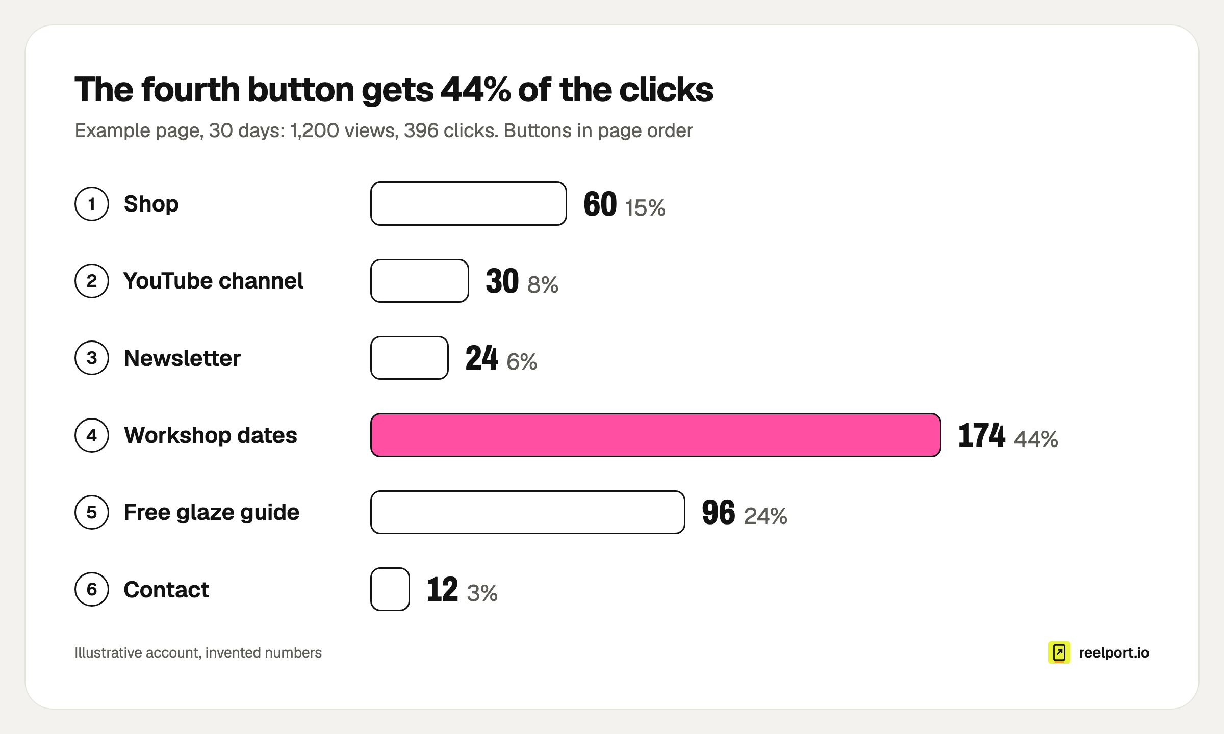
In the example, the fourth button gets 44% of all clicks, so it belongs at the top.
Then test like this:
- Write down this month's views, clicks and clicks per block.
- Change one thing: the order, or one label.
- Leave it for 14 days, with your usual posting rhythm.
- Compare the click rate and the share of the block you moved.
- Keep the change if the top block's share went up. Otherwise put it back.
For a label, an A/B test is faster: half the visitors see "Workshop dates for October", half see "Book a workshop", and the stats show which one is tapped more.
Do you need a cookie banner on a link in bio page?
That depends on what the page loads. A page that sets no cookies and loads nothing from third parties has nothing to ask consent for. A page with ad pixels, or an embedded player that loads on arrival, is a different case, and one to settle with whoever advises you on privacy. On a one-screen page, a banner also covers the offer you just moved to the top.
Two checks for visitors from the EU:
- What loads before a tap. Open your page in a private window and look at what it requests. Embedded videos, maps and music players should load only after the visitor presses play.
- Proof of consent for email. Under Article 7 of the GDPR, you must be able to demonstrate that a person consented. A double opt-in, where the address counts only after the visitor confirms it by email, gives you that record.
Where reelport.io fits
Link in Bio is part of every reelport.io plan, the free one included, with pages at reep.li/yourname. The ideas above map to its blocks: products and tips paid through your own Stripe account, a shop grid of your Instagram posts, email sign-ups with double opt-in, download pages for lead magnets, events that hide themselves, scheduled blocks, country and language rules, links behind a code and an A/B test for buttons.
Pages set no cookies and load nothing from third parties by default, and the stats show views, clicks, click rate and clicks per block, with QR scans as their own source. The link-by-DM button runs through reelport Chat, which is in every paid plan. Pages live on reep.li only; your own domain is not supported. If you are moving from another tool, the Linktree comparison lists the differences, and the bio page shows the templates.